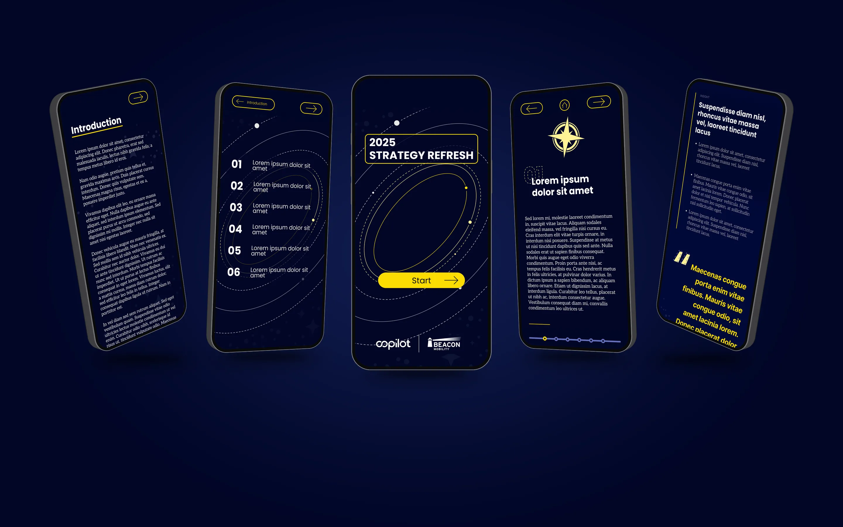

Five phones fanned out on navy, showing screens from the Beacon strategy primer.

Beacon Mobility

Context
Beacon Mobility, via Everyone Needs a Copilot
Role
Designer (UX/UI and graphic design)
Timeline
Feb 2025

Overview

Copilot had a dense body of research for Beacon Mobility's leadership to absorb before a two-day strategy workshop. The team wanted it to be more engaging than a static PDF. It was my job to design an interactive mobile primer to send ahead and a printed placemat for the room. The results were highly successful and praised by Beacon's leadership.

The Problem

Important research that could easily read like homework

Copilot, a consulting firm, had interviewed leaders and workers across Beacon Mobility, a school and high-needs transportation company, and synthesized what it heard into six forces pulling the business off course. Beacon's C-suite needed to take all of it in before a two-day workshop, where they would diagnose those challenges and define a North Star for a strategy refresh.

The research was factual and dense: six forces broken into 20 sub-sections, which became 31 mobile screens and a placemat in two weeks. Executives would have read whatever we sent them. But the Copilot team wanted it to be more engaging and fun, not just a wall of data and findings, and the brief asked for a "showstopper; not your traditional deck readout." If we could make it better than a PDF, why not?

The content was written by Copilot. I owned how it looked and how it worked. The research and design lead gave me critiques day to day, but otherwise let me run with it.

The Process

  1. Mood board
  2. Desktop concept
  3. Mobile pivot
  4. Primer build
  5. Placemat

Discovery & Research

Borrowing structure from maps and brand guides

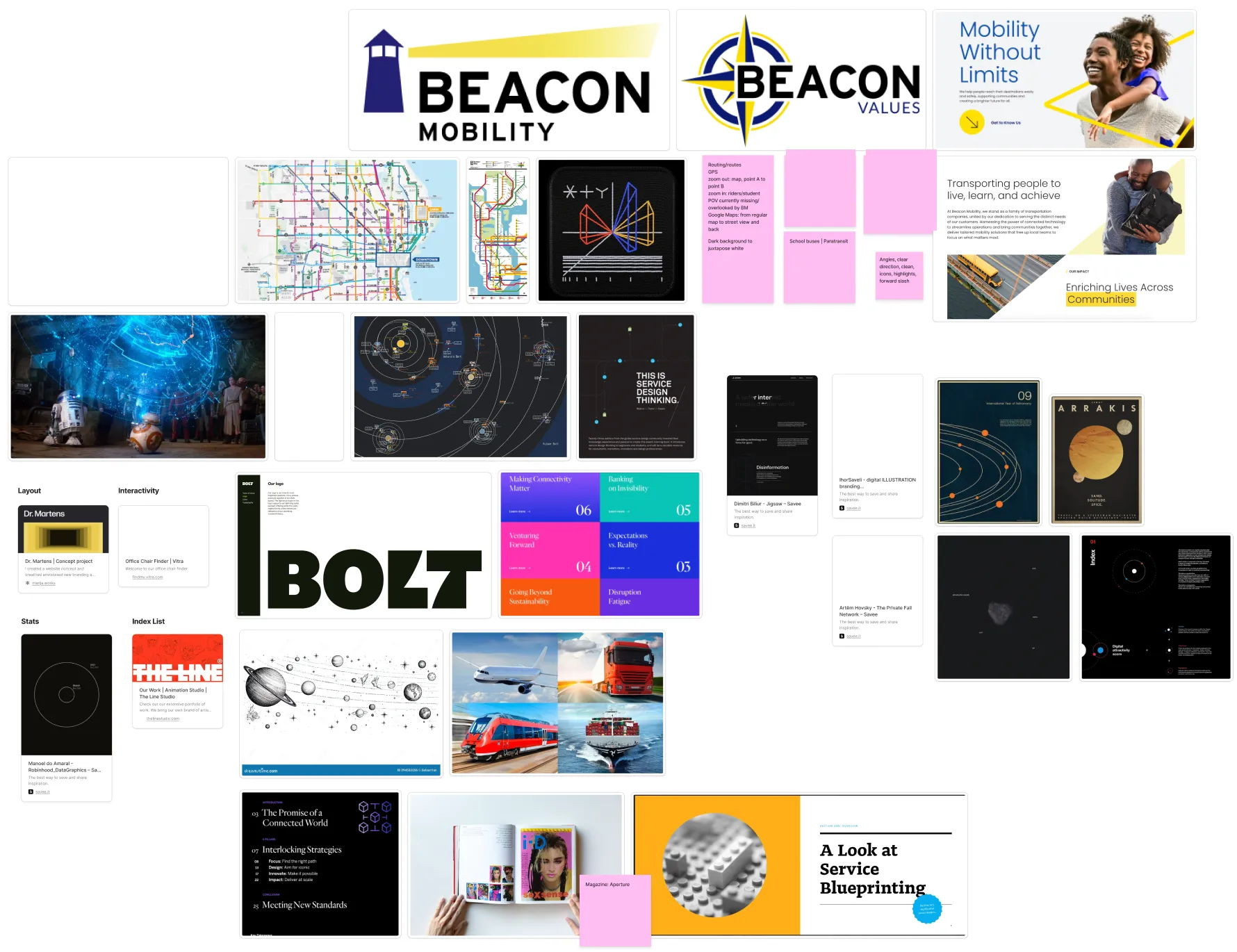
Mood board of maps, wayfinding systems, brand guidelines and magazine layouts.
The references were about structure first, style second.

I didn't do the content research. My research was visual. I knew the material was data-heavy, so I asked how other things display a lot of complex information cleanly:

Maps and wayfinding
I wasn't designing a map, but maps are built for dense information that people need to move through.
Brand guidelines
What carried over was their structure: a section, then subsections, then the next section.

I also looked at the magazines and microsites the team shared, and everything had to stay within Beacon's blue and yellow brand colors.

"I'm not designing a map, I'm designing something with all dense information."

Maps were a reference, not the answer. What I was really designing was a way through the information.

Ideation & Concept Development

Space, because the research already spoke it

The question became:

How might I make it more likely they get through all of the information?

Maps and wayfinding
My starting point, and it shaped the first layouts.
A designed PDF
Readable, but a static wall of text was exactly what we were trying to avoid. We exported one anyway, as a backup.
Space
Copilot's writing talked about forces that "behave like gravity" and pull the company away from its goal. That felt like outer space. The space idea grafted over the maps, and the team liked it, so we ran with it.

Iteration

From a desktop galaxy to a primer for the road

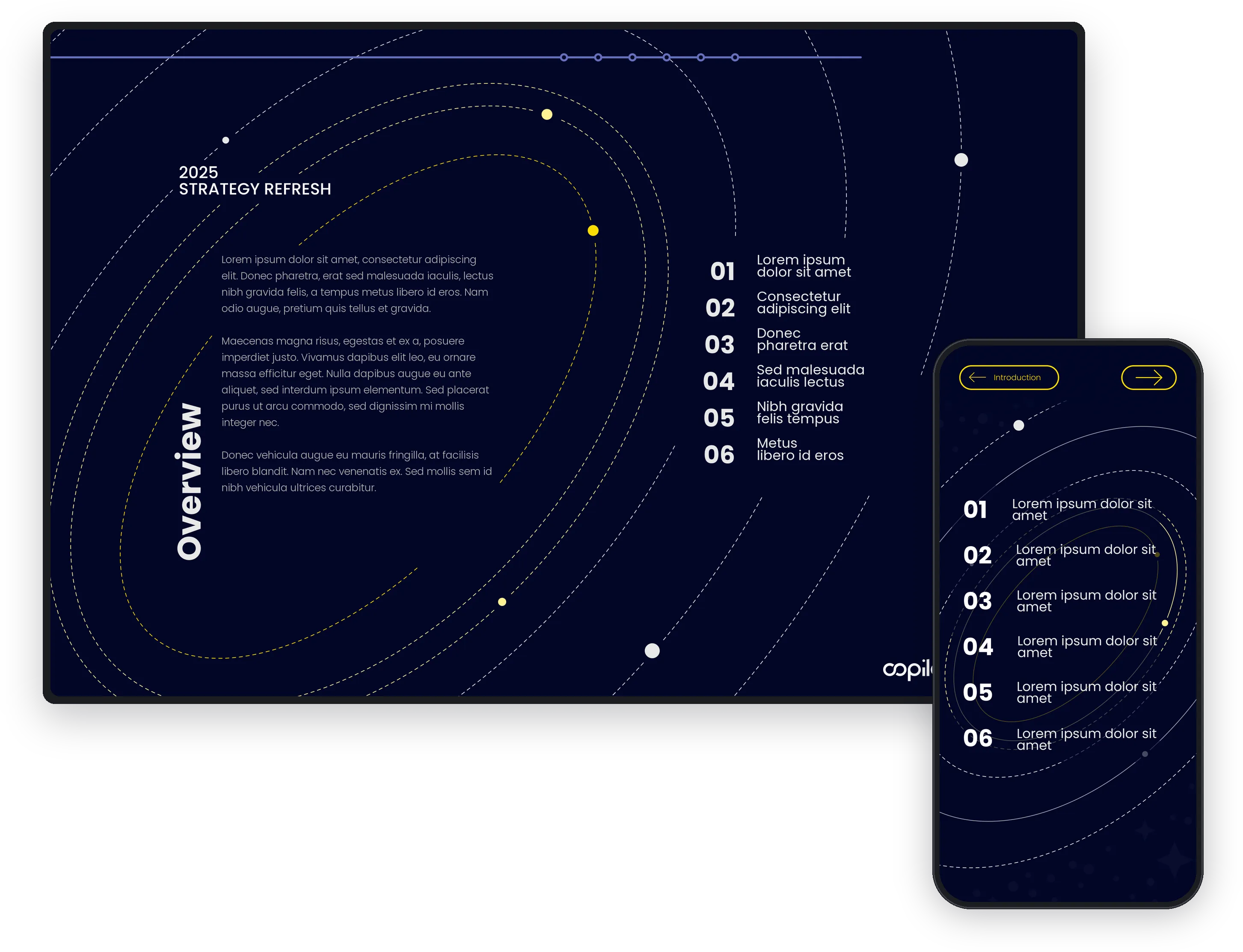
The desktop galaxy concept next to the mobile primer, showing the same six forces.
The same six forces, rebuilt for a phone.

The first version was a desktop prototype: a navy galaxy with dashed orbits, the six forces listed 01–06, and a progress rail across the top.

On desktop, I wanted the galaxy to rotate to each section's planet when you selected it. Figma's Smart Animate couldn't make it smooth, so I dropped it before the pivot. Mobile settled the rest: no hover states, and a much smaller screen where large motion would feel cluttered and busy. The tradeoff was less motion, so the click-through and the visuals had to carry the engagement.

During one of my many check-ins, the design director pointed out that executives would most likely look at this on the road or while traveling, maybe without a laptop. The research and design lead and I agreed: it made a lot of sense. So we decided to focus on a mobile-first solution. A mobile screen still works on a desktop, but a desktop Figma prototype doesn't work as easily on a phone.

The first thing I built at phone width was a type test, testing type sizes to see what would still read on a mobile screen. Then I rebuilt it as a vertical scroll. The map-like layout disappeared completely. The brand-guide structure of sections and subsections stayed. The biggest cost was real estate: all of that information now had to fit a much smaller screen without feeling crammed.

Solution

A primer to read on the road, a placemat for the room

An interactive primer
A mobile Figma prototype with an intro, a table of contents, and the six forces, each with its own sub-pages of insights, impacts, and interview quotes. It was sent before the workshop.
A placemat
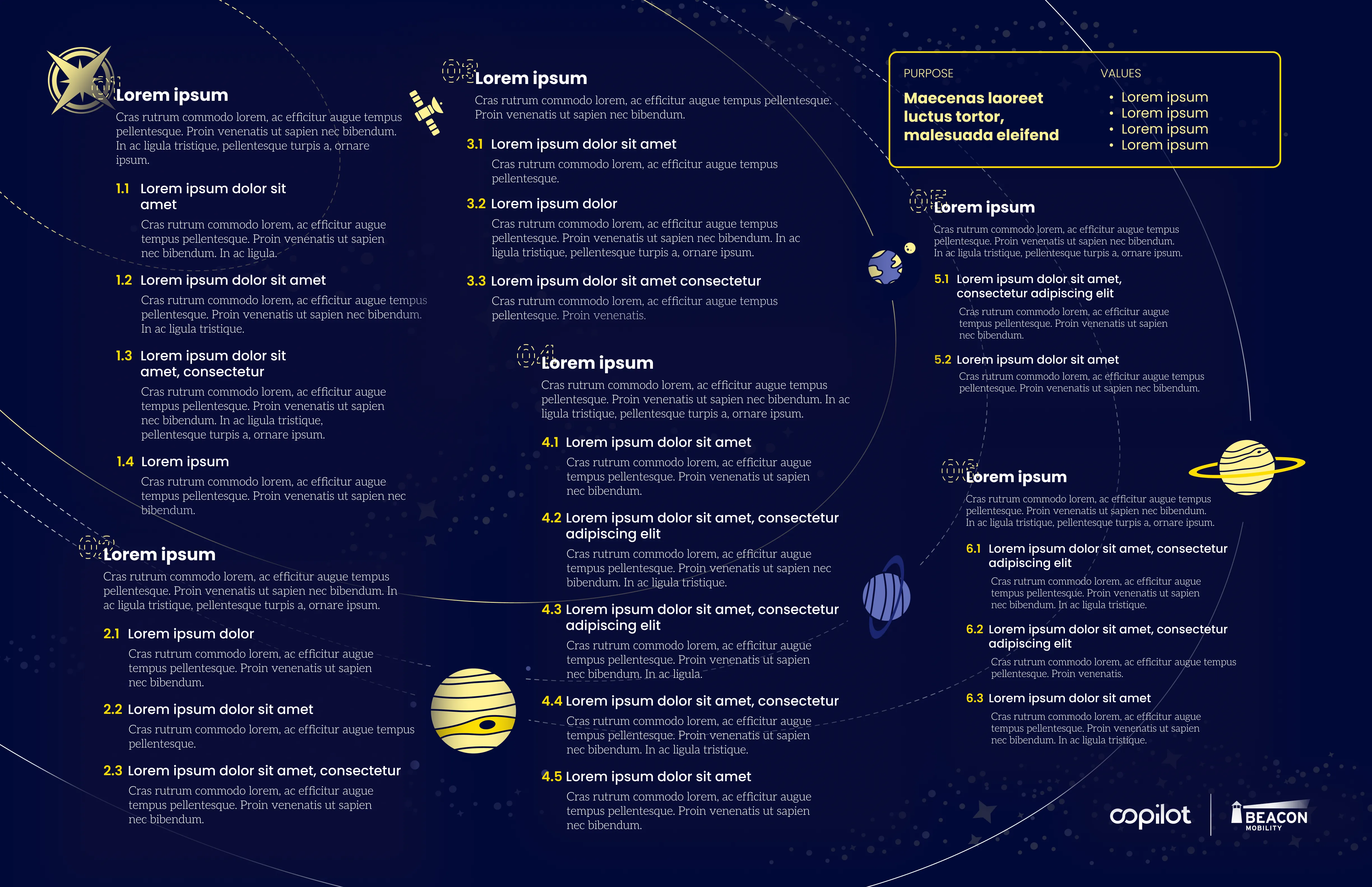
One printed 11×17 sheet per person with every section and subsection, so executives could glance down during the workshop instead of digging back through the primer. Printed text can't be zoomed, so readability set the layout.

01. Make long pages easy to scan and easy to leave

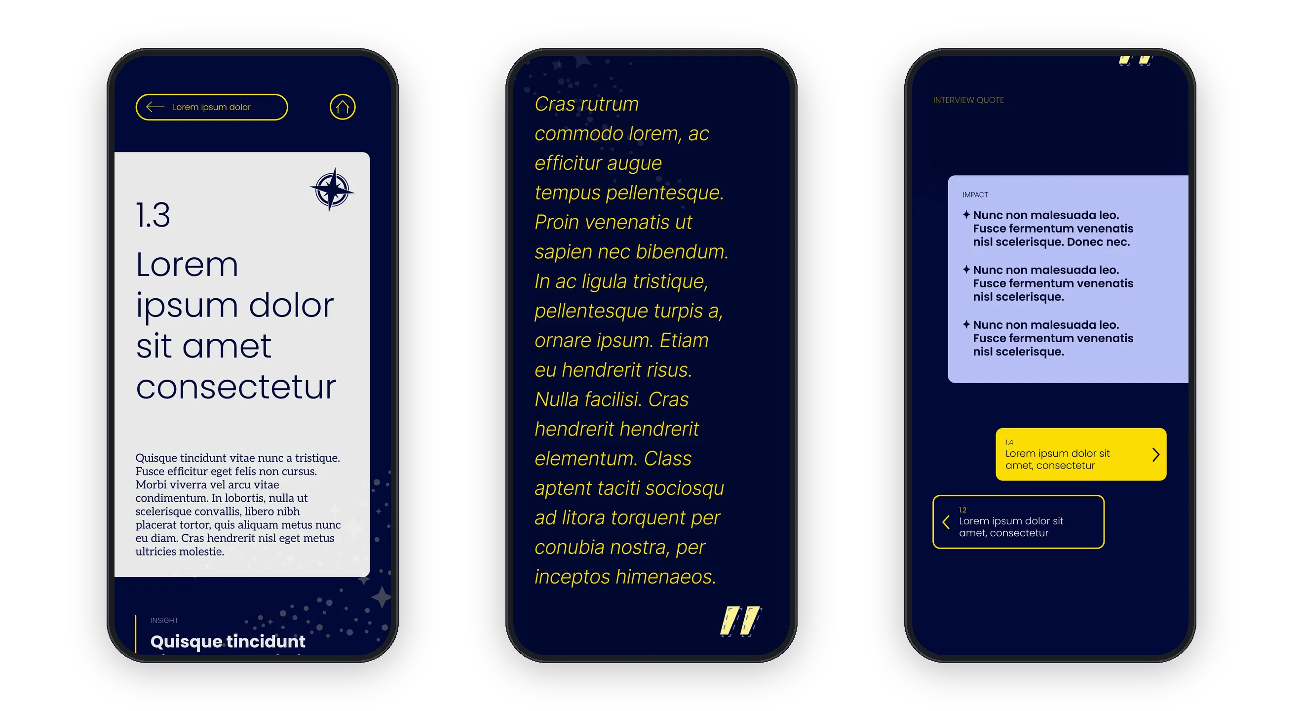
Three phones showing primer sub-pages with yellow quotes and blue impact callouts.
Quotes in yellow and impact in blue, so a long page still scans on a phone.

Every sub-page ran several screens long on a phone. So I made the hierarchy do the work:

Quotes
Big and yellow, so they caught the eye.
Impact
In blue.
Dividers
Between parts, and a bright intro that stands apart from everything else.

For navigation, a solid Next button pulls you forward and a lighter Back stays out of the way. The top bar takes you either to the start of the section or Home to the table of contents. Progress dots show which of the six forces you're in, and you can tap them to jump.

02. Turn the research's own language into a solar system

Strip of the six planet and star icons, one for each force.
Each of the six forces gets its own planet or star.

The research described forces with gravity, so I gave each of the six forces its own planet, star, or other space-related icon. The galaxy sat on a deep navy background with dashed orbits, and I added small stars behind the content.

The content kept moving while I designed. Some icons were chosen before their sections were renamed: a section about Beacon's people, drawn as Jupiter with planets around it, became "The M&A Machine." The visual system had to absorb those changes.

The team took the motif into the content itself. Copilot added a page to the primer explaining it to executives: "we connected them to a specific planet or star to create a memorable connection. This wasn't by accident, but by design."

03. Mirror the primer on one printed sheet

The printed 11×17 placemat with every section and sub-section summarized.
One printed 11×17 sheet per person, with every section and subsection.

The placemat used the same planets and the same numbered sub-sections as the primer, so what executives saw on the sheet matched what they had read. Every sub-section got a one-line summary, next to a Purpose and Values box. The cost was depth: one line each, with the detail left in the primer.

Impact & Results

Used in the room, highly praised

The primer and placemat were handed off a few days before the workshop and were used during it. Executives went through the primer and used the placemat in the room. The Copilot team relayed that participants "loved it," that the primer turned a large body of synthesis into something "meaningful and usable" for the client, and that some executives kept the placemat after the workshop.

Reflection

Scope early, stay ready to turn

  • What went well

    I made something that felt unique, a new experience for the people using it and for me. Visually it was pretty fun, and it was well structured. I took a format change mid-build and absorbed sections renamed after I'd drawn them, all before handoff.

  • What didn't go as well

    I spent time going down a desktop path before the format changed. The rotating galaxy never animated the way I wanted. The placemat was a squeeze: everything had to fit one sheet at a readable size, and that dictated the layout.

  • What I'd improve

    With today's prototyping and AI tools, I'd build a responsive primer that works on desktop and mobile, with more of the motion I'd planned. I'd make the placemat more utilitarian, with less decoration and more information, or try a digital quick reference on a phone or laptop.

Scope as soon as possible so you don't waste time, but stay flexible enough to change midstream if needed.