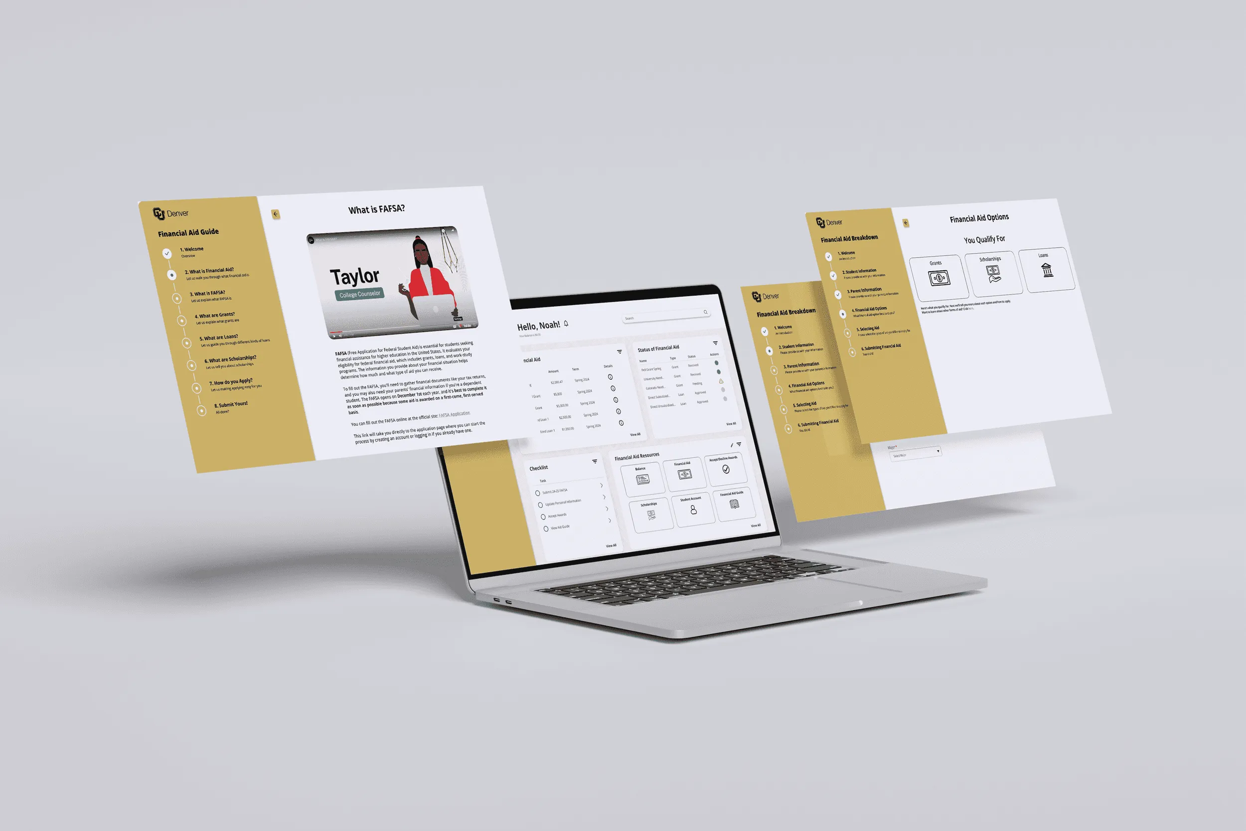
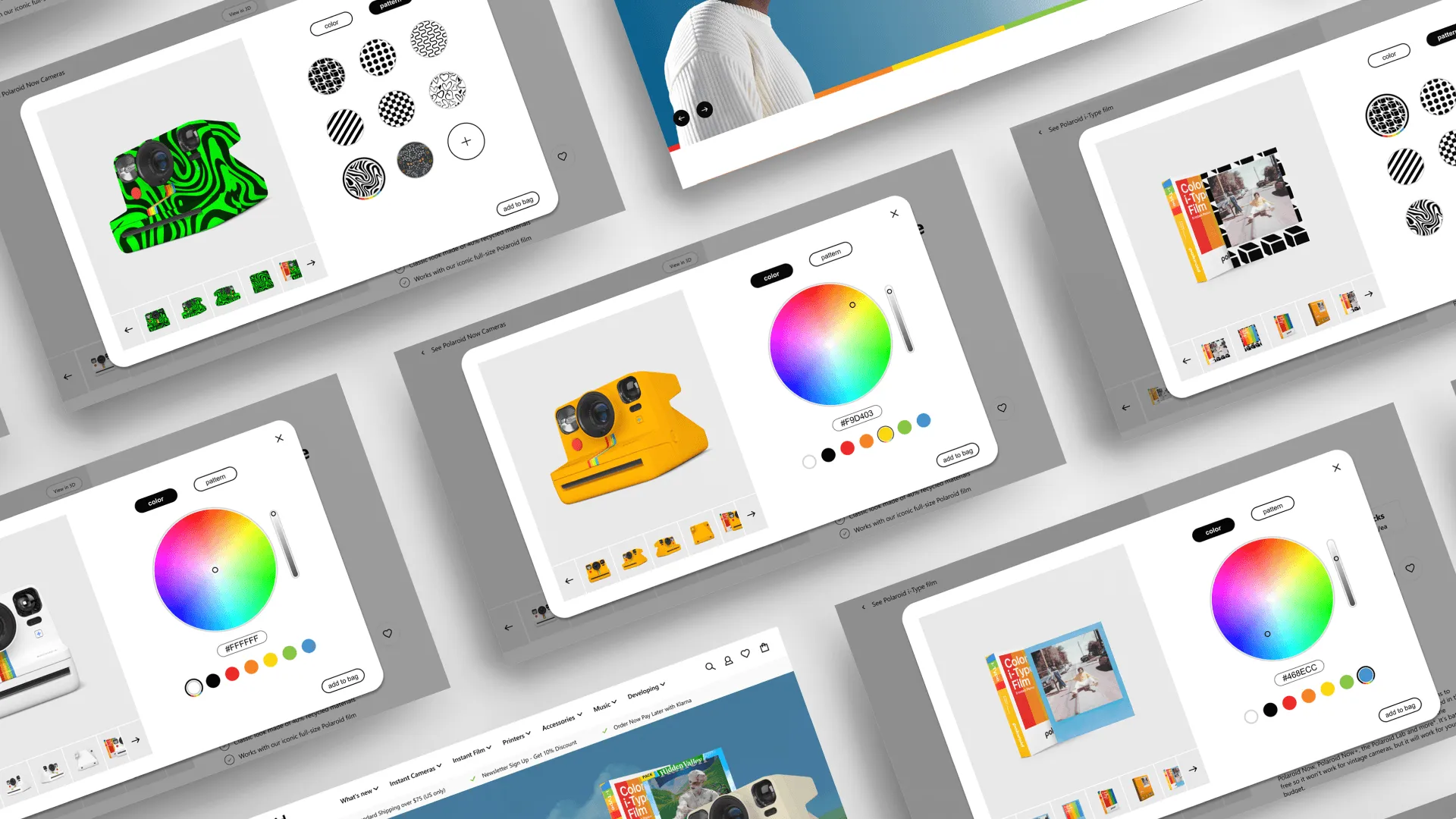
A laptop showing the redesigned financial aid portal, with screens floating around it.

Rethinking Financial Aid at CU Denver

Context
CU Denver, BFA senior thesis
Role
Service designer
Timeline
Feb–May 2024

Overview

Financial aid is a vital part of going to school, and one of the most stressful, hardest-to-navigate parts. For my BFA thesis, I used service design to rethink CU Denver's aid experience from both sides: four connected tools that help students understand, choose, track, and get help with their aid, and a portal that helps staff respond.

The Problem

A vital process that's very hard to navigate

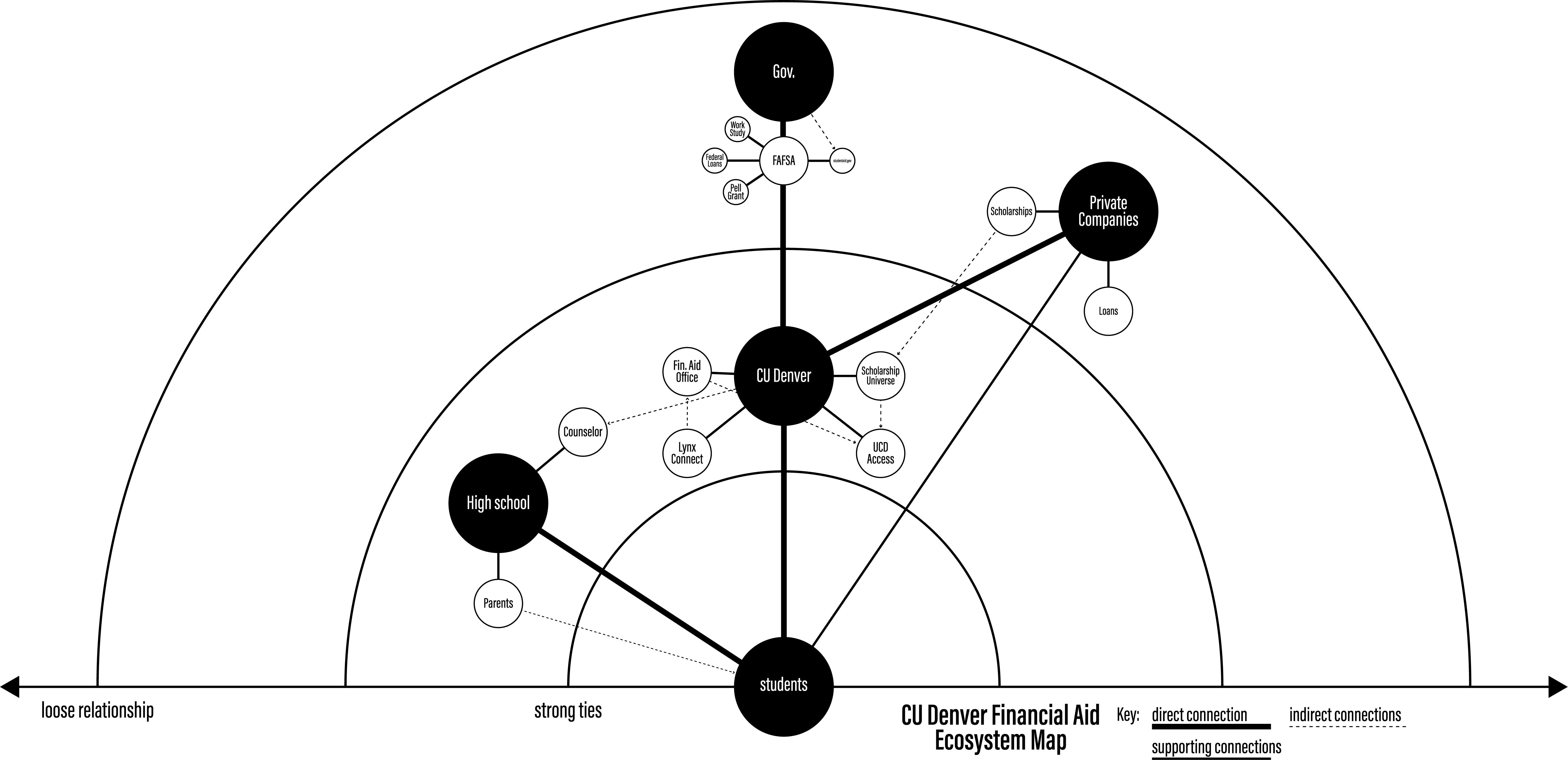
Ecosystem map of where students learn about, find and apply for financial aid, with the school's part highlighted.
Financial aid runs through many systems. One person, in one semester, could change the school's part of it.

My thesis brief was left wide open, so I chose a problem I had lived with. In five years of college, I ran into an issue with financial aid almost every year. One fall, I logged into a student portal and saw my balance had gone from zero to roughly -$2,000. Instead of being told beforehand, I had to call after it had already happened to learn that the financial aid office had awarded me more aid than it should have, then pulled it back. By then it was November. I had already paid for classes and was living on the rest. Another year, my aid hadn't arrived a month into the semester. When I called, I was told it should have reached me two weeks earlier: the school's system had never sent it. They had to send it manually, and it arrived the next week, along with a late penalty I had to pay for the school's error.

I'm far from alone. 17.8 million students applied for federal aid through FAFSA (Bankrate, 2023). Financial aid is complex, stressful, and hard to navigate, and most students can't get through school without it.

The problem is that financial aid is overly complicated. So my question became: how can I use service design to improve the financial aid process for students at CU Denver?

I did this project on my own: the research, synthesis, journey mapping, concepts, wireframes, prototypes, visual design, and the final pitch deck. With one person and one semester, I couldn't take on FAFSA or the government side. An ecosystem map of where students learn about aid, find it, and apply for it showed me where one person could make a difference: the school. Everyone at CU Denver goes through the same aid office, the same portal, and the same deadlines, so I focused there.

The Process

  1. Ecosystem map
  2. Research
  3. Synthesis
  4. Journey map
  5. Four key moments
  6. Concepts
  7. Wireframes, prototypes, visual design
  8. Pitch deck

Discovery & Research

Three pain points, heard across every grade

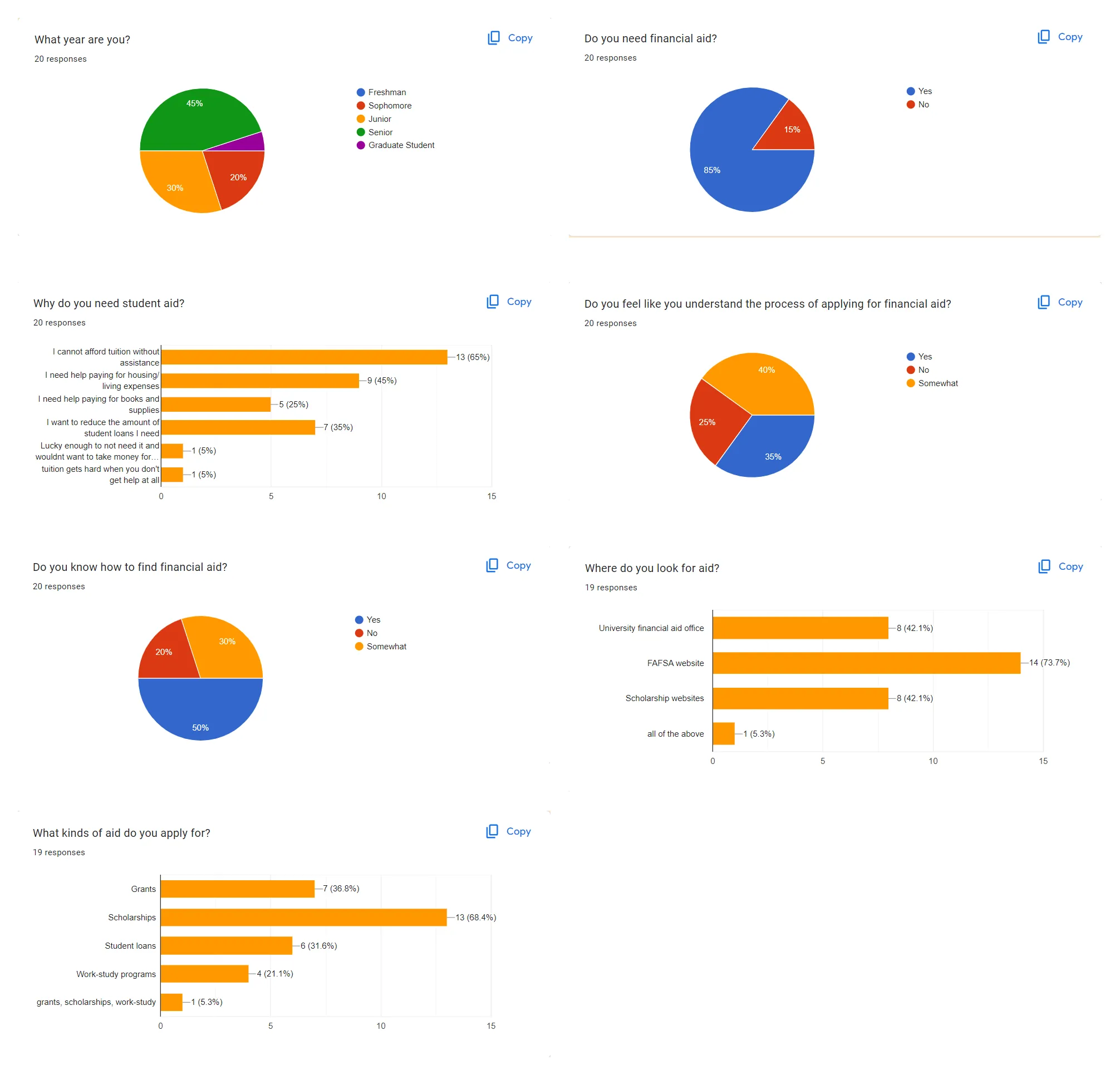
Charts from the student survey about understanding and applying for financial aid.
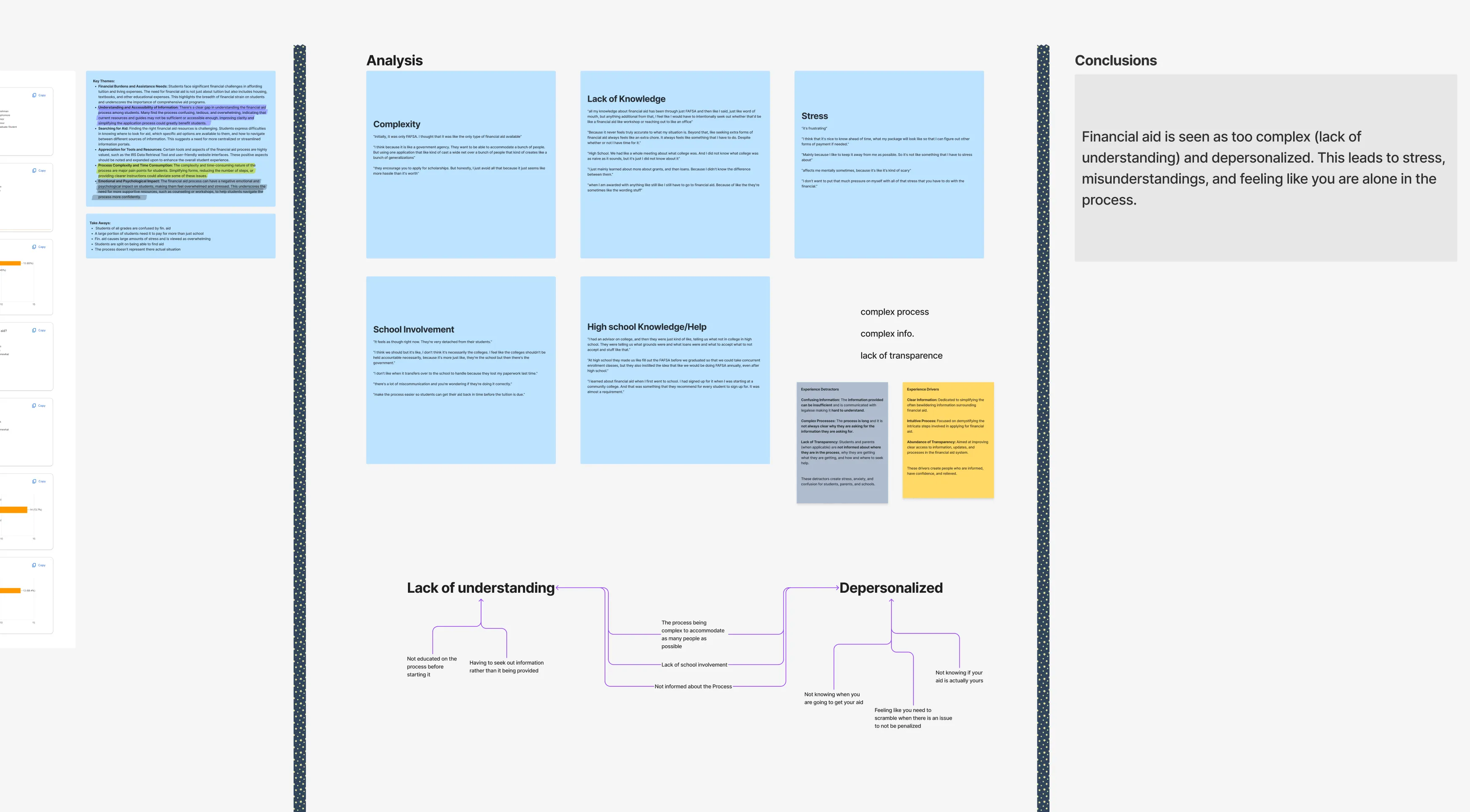
Synthesis board grouping interview and survey findings into themes and conclusions.
Students in every grade were confused, and the same three pain points kept coming up.

I started with a learning agenda (what I needed to learn about how students experience aid: what they know, how they feel about it, where it hurts) and a research guide for how I'd learn it. Over about six weeks, I used two methods together:

  • A survey of about 20 students from a variety of grades, for the broad picture.
  • Interviews with three students (Student A, B, and C) for specific experiences, plus the Chairman of the Financial Aid Office, to see how the school understood students' aid experience: the problems students bring in, what staff can help with, and what they can't.

I brought the transcripts and survey results into FigJam, synthesized each set, then looked for themes across them. Three pain points came up again and again:

  • Pain point 01

    Confusing information

    65% of students surveyed weren't fully sure they understood the process of applying for aid (40% "somewhat," 25% "no"). As one put it: "I just feel like I understand the concept, but when actually doing it it's confusing or makes me feel really stressed."

  • Pain point 02

    Complex processes

    "The length and complexity." "It can be overwhelming."

  • Pain point 03

    A lack of transparency

    "I don't like how time-consuming and impersonal the process is."

Two interviews pushed past those themes. Student B is a first-generation college student. No one in his life had been to college, and English is his second language. Every time he got aid or needed to apply, he went to the office to ask: "Is this real? What is this? Am I accepting the right kind of aid?" He was confused and overwhelmed, with no one else to turn to.

The Chairman told me two things that changed what was possible. The office was understaffed, and federal regulations prevent the school from telling students what aid they should accept.

Insights

The on-ramp is the problem

Financial aid assumes everyone has the same starting point, when that's not the case.

A first-generation, non-native English speaker and the child of accountants go through the same process, but with very different levels of understanding. The three pain points told me what was going wrong. Student B's story told me why: the process treats everyone as if they start in the same place. From then on, every solution had to bring each student up to a shared baseline before asking them to make decisions.

Ideation & Concept Development

Built to reach every student, wherever they start

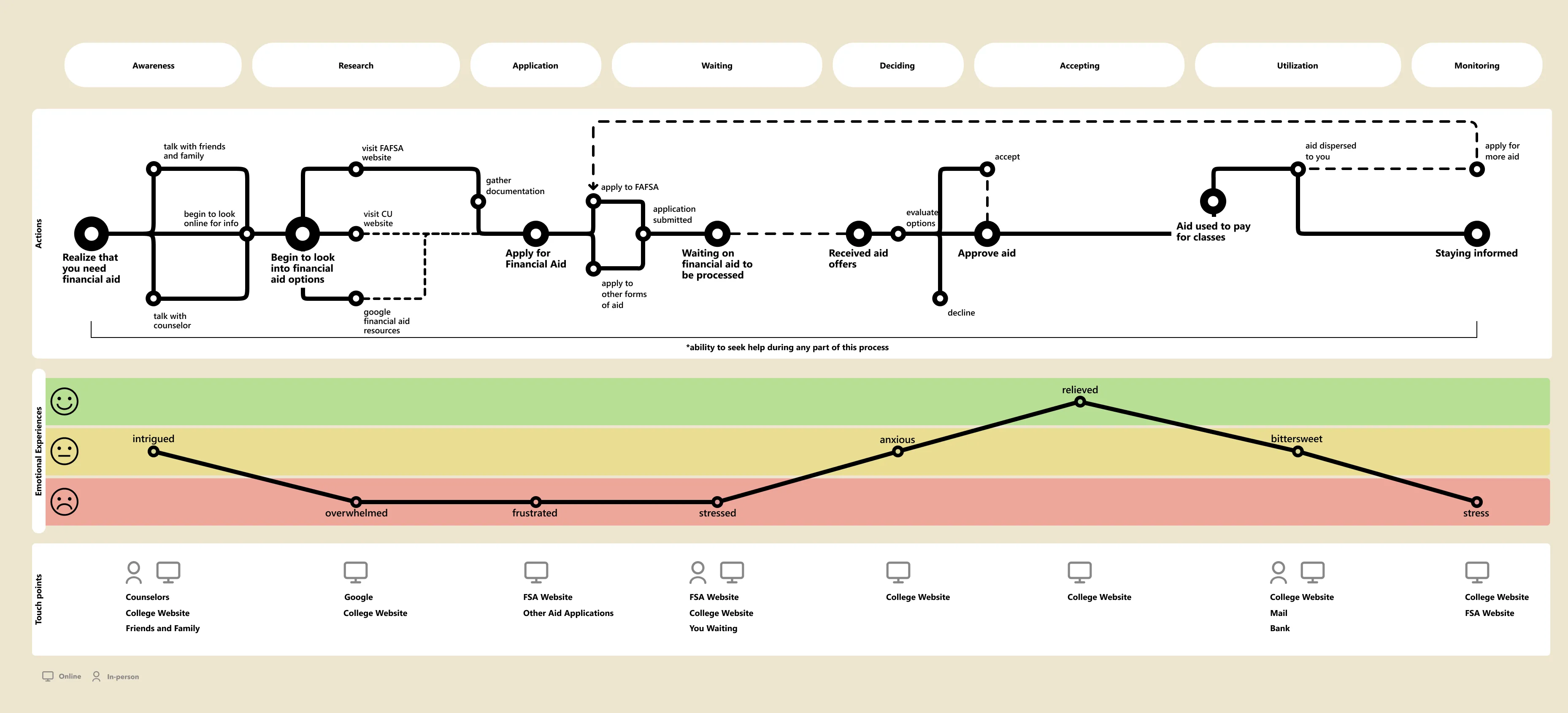
Current-state journey map from awareness to monitoring aid, with how students feel at each step.
Mapping the path from needing aid to receiving it turned three pain points into four moments to design for.

With this knowledge in hand, my goal evolved and became:

How might I transform the financial aid process into a transparent, guided experience that empowers students rather than overwhelms them?

Before the research, I believed the school could tell students what to apply for, and that the fix was a better form and portal. The Chairman's federal rule ruled that out. Instead of telling students what to choose, the school could show each student their options, using the information it already has.

My first concepts were in person: a pamphlet or an orientation session. I dropped them because they couldn't reach everyone. I couldn't attend my own student orientation, so I shouldn't expect others to be able to. I needed to meet students where they were. Every student already has access to the aid portal, and anyone without a personal device could use a campus computer to access it. So every solution became digital.

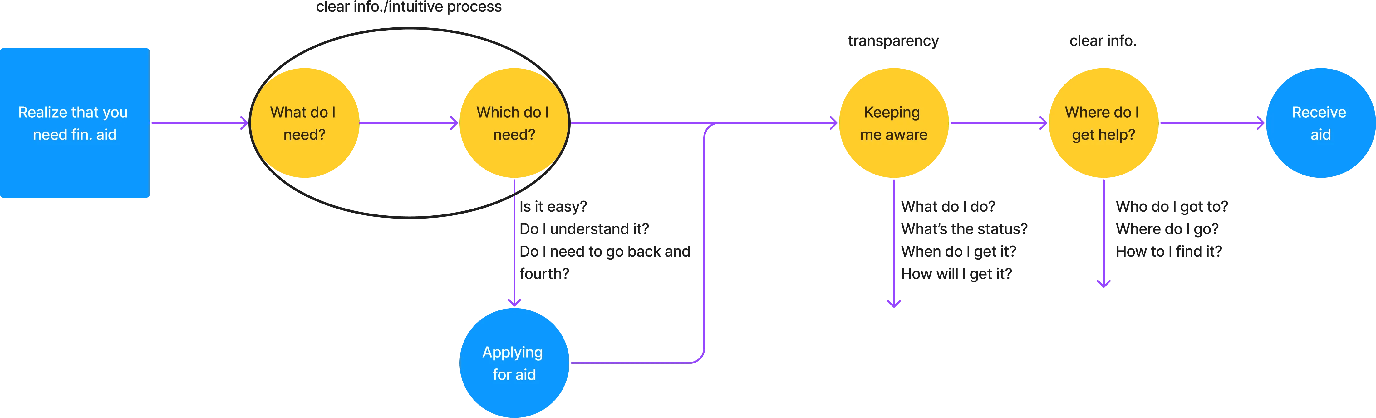
To decide what to build, I mapped the current-state journey, from awareness through research, application, waiting, deciding, accepting, using, and monitoring aid, including how students feel at each step. From that map, I drew a simple flow from realizing you need aid to receiving it, and found four major moments to design for:

Rough user flow from realizing you need aid to receiving it, marked with four key moments.
  1. 01Understanding what aid is
  2. 02Choosing the right kind of aid
  3. 03Staying informed
  4. 04Getting help when you need it
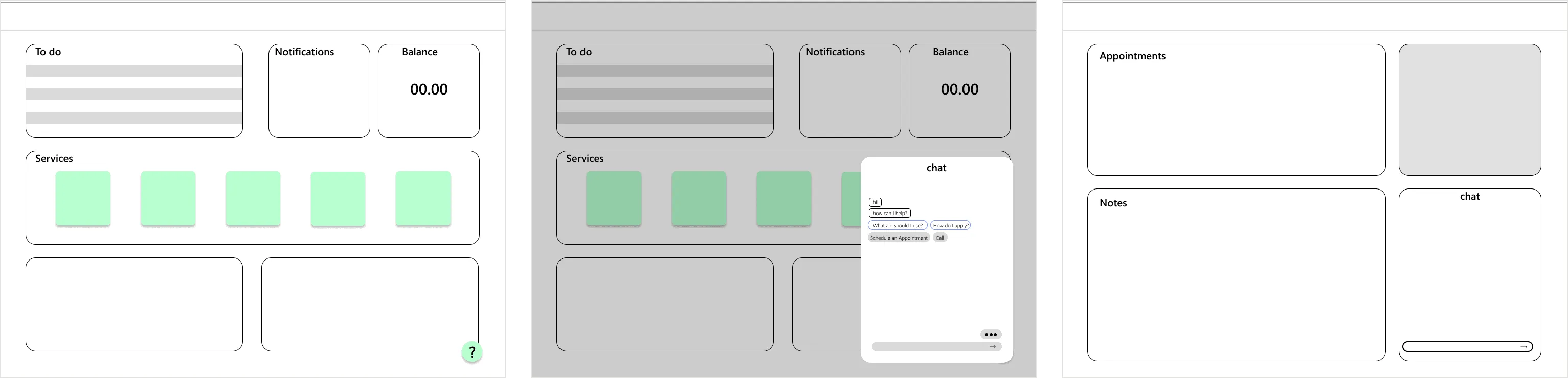
Early wireframes of the student dashboard, the chat and the staff portal.
Early wireframes of the student portal, its chat, and the staff portal, before the final screens.

Solution

Four tools along one path, from learning to getting help

Each moment has a tool, and all of them live in one portal.

I designed four concepts, one for each moment, and took them from wireframes to screens:

Aid Guide
A walkthrough of what financial aid is and the kinds that exist.
Aid Breakdown
Each student's best aid options, based on their own information.
Improved aid portal
One hub with a checklist of every step and deadline.
Help tools
A chatbot and appointment scheduler for students, and a staff help portal for the office.

01. Understanding what aid is

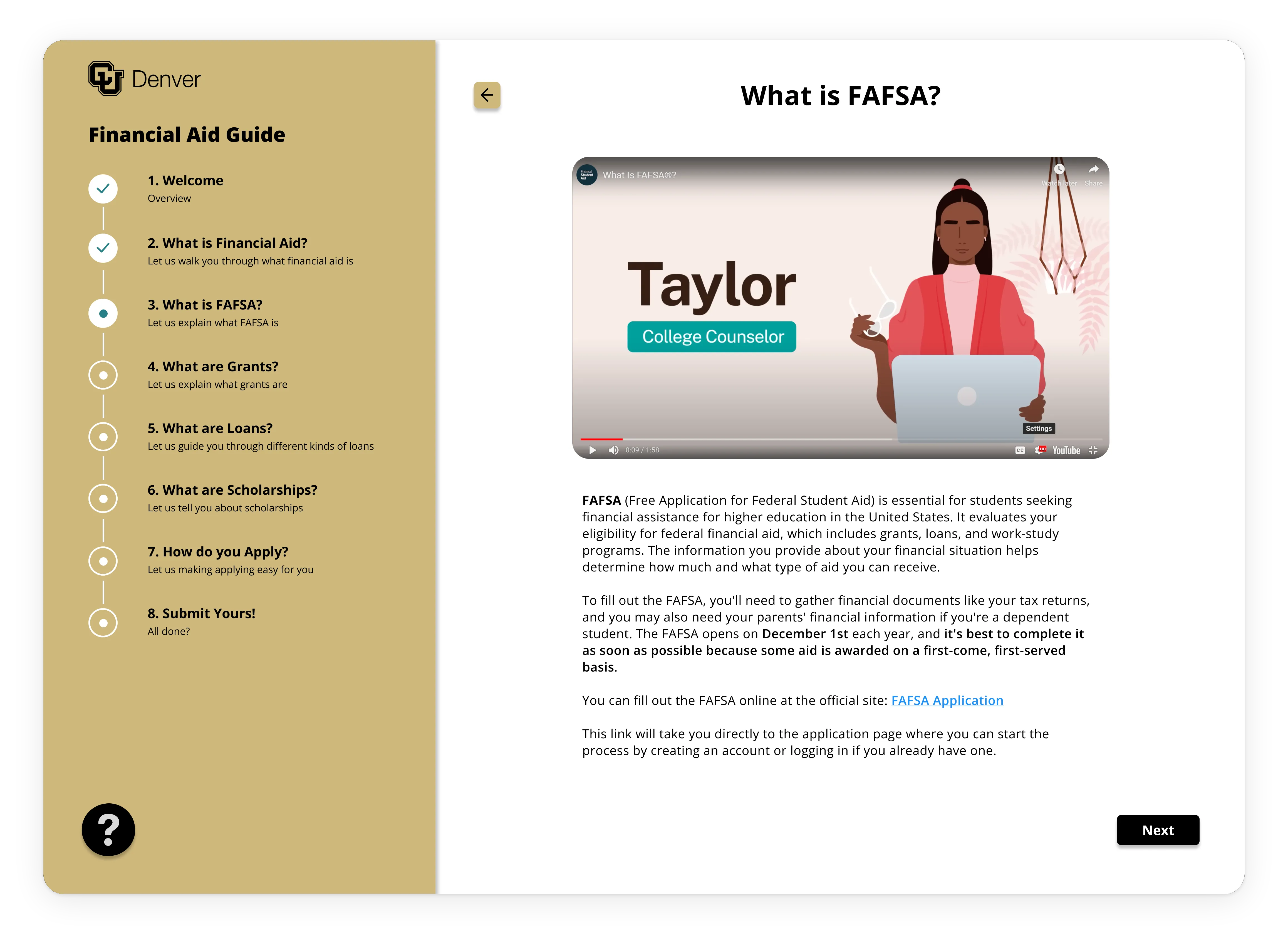
Aid Guide screen walking a student through the FAFSA step.
Aid Guide

The confusion showed up across every grade, and Student B showed what happens when a student starts from further back. The Aid Guide gets everyone to at least a baseline understanding before they choose anything. It explains what financial aid is and walks students through the different kinds. It's the first thing a student sees when they open their portal, so it reaches every student, not just those who make it to orientation.

02. Choosing the right kind of aid

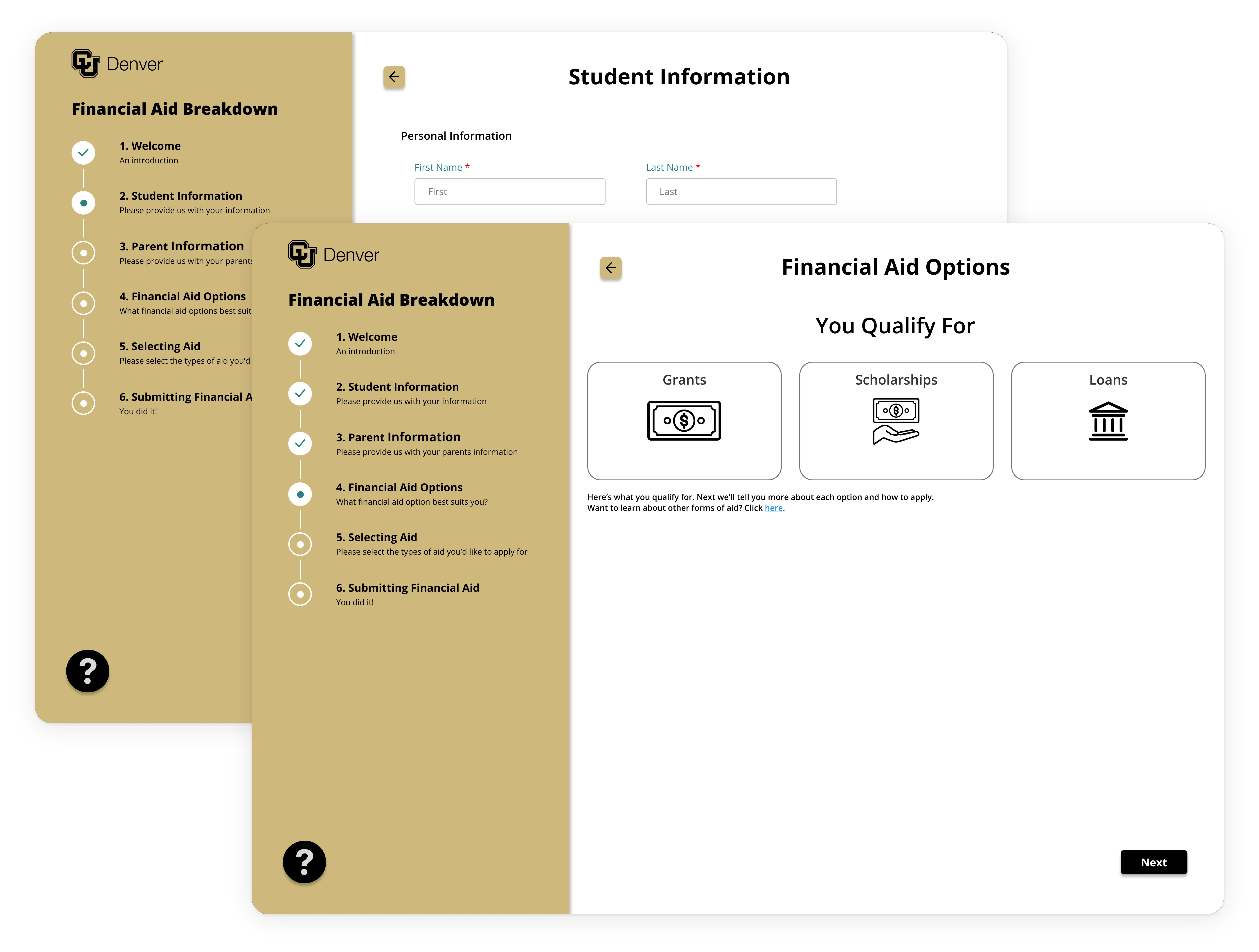
Aid Breakdown screens: the student's information and their best aid options.
Aid Breakdown

Before, students got little more than "here are the kinds of aid, figure it out." Staff can't tell students what to accept, but the school already holds what's needed to narrow the field: FAFSA forms, deadlines, and each student's background. The Aid Breakdown uses that information, plus a few questions to fill any gaps, to say: based on your information, these are the forms of aid that would benefit you most. What would you like to do?

It's an addition, not a replacement. Nothing existed there before. The cost is that it narrows things a little: it points students toward some options and away from others. But it never says "pick this." The decision stays with the student.

03. Staying informed

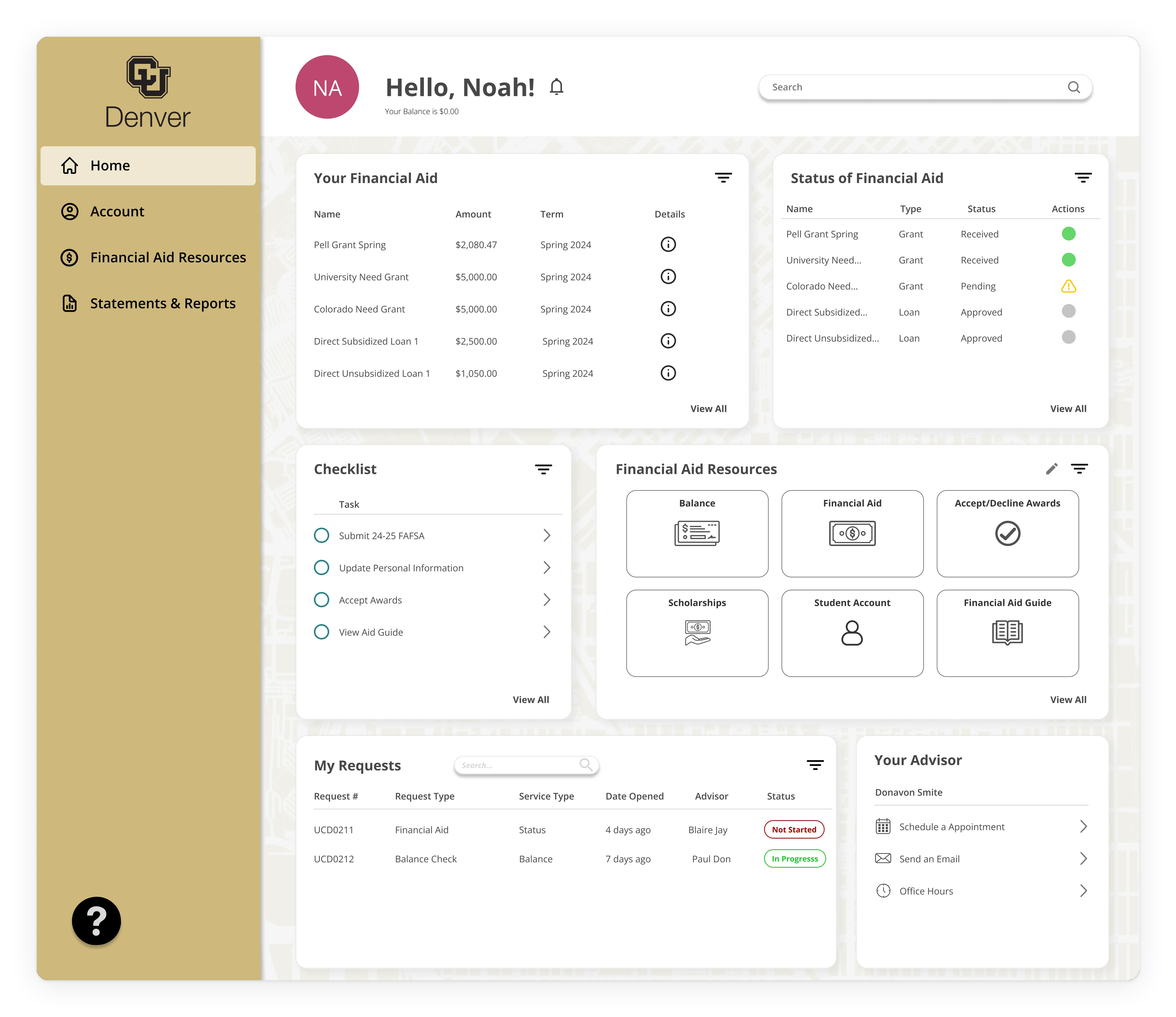
Improved student portal with a checklist of every aid step and deadline.
Improved Student Portal

The existing aid portal was flimsy. It didn't explain much, and it wasn't where you went for help. People don't want to visit three pages to understand one process. So this centralizes it. One student wrote: "It's really frustratingly slow, to the point where I don't know there is a problem until it's too late and I have late fees."

The improved portal becomes the hub. On a student's first visit, it walks them through the Aid Guide and the Aid Breakdown, and then becomes where they manage everything. A checklist keeps dates in view: when FAFSA opens, your deadline, apply, accept your awards, view your aid. It also shows what's done, what's pending, and anything that has a problem.

04. Getting help when you need it

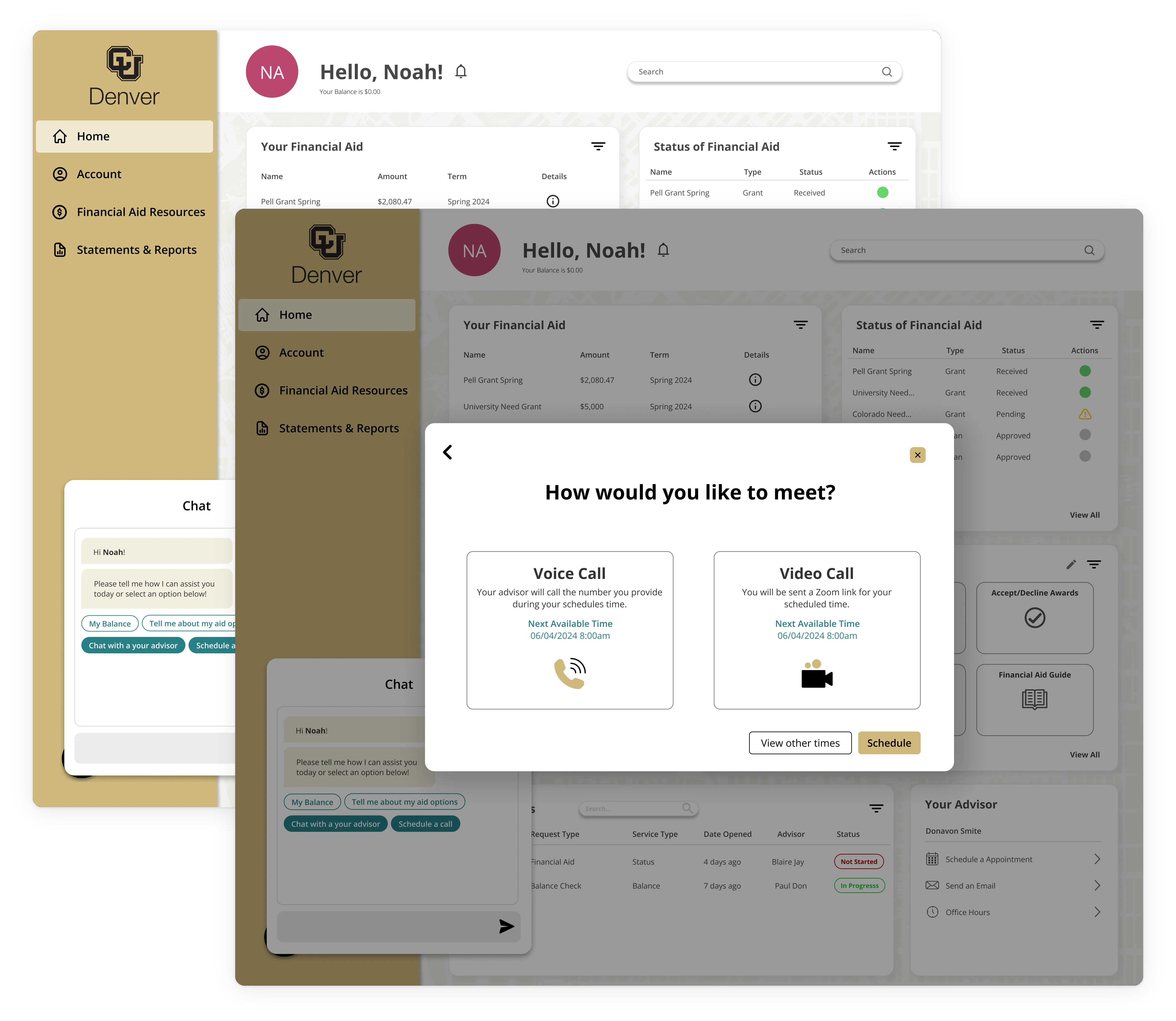
Student portal help screens: the chatbot and the appointment scheduler.
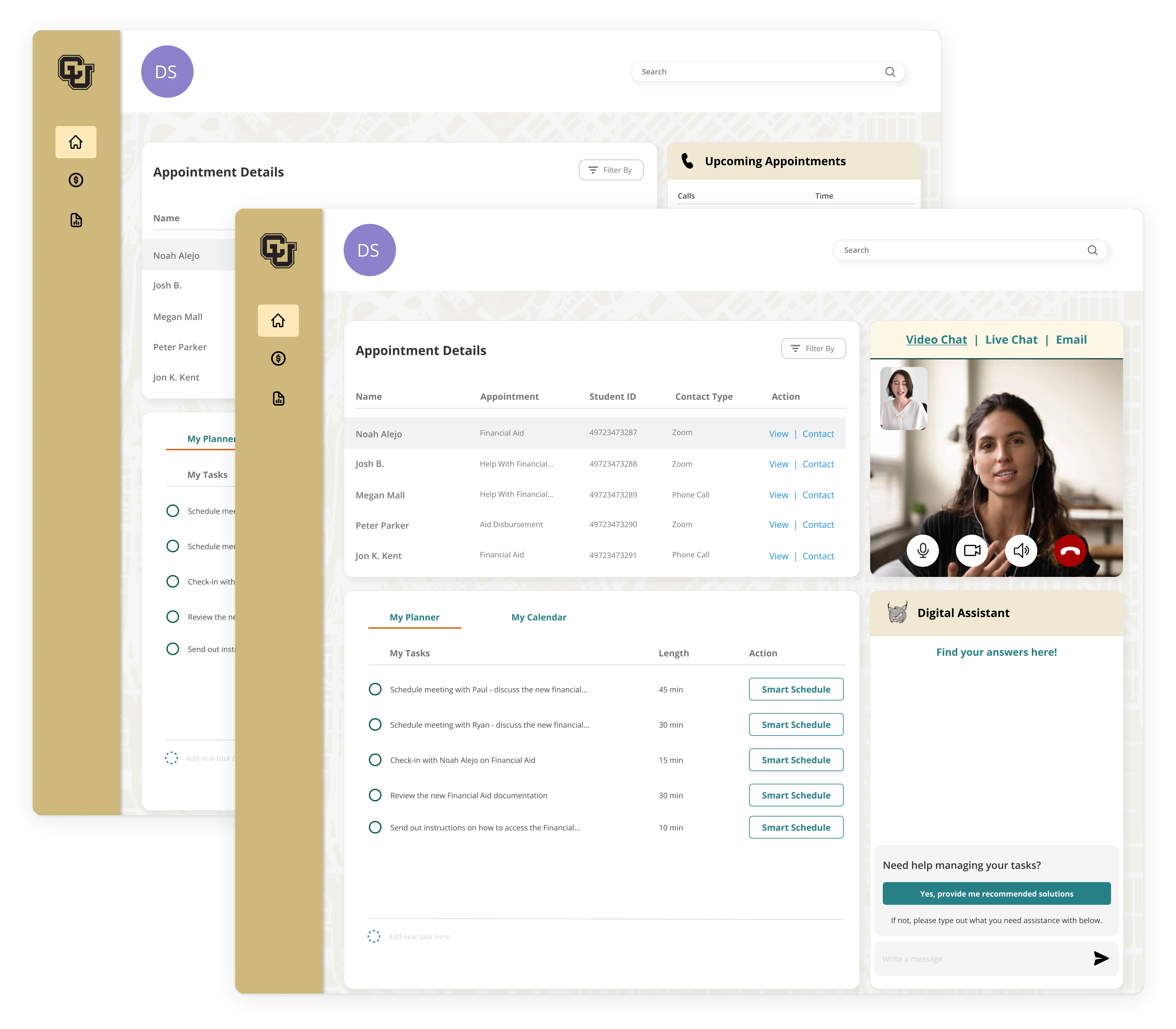
Staff-facing portal for managing student requests and meetings.
Improved Student Portal help screens and Staff-Facing Portal

The office was understaffed, and the aid site offered no way to schedule aid counseling. So the portal gives students as many tools and as much information as possible to solve issues on their own. They only call or book a meeting when something truly needs a person: "Is this a basic fix, or does this need someone to step in?" A chatbot answers simple questions, like when aid opens or when it's due, so staff don't have to triage each one. A scheduler lets students book time with the office.

Staff also have to respond to students' needs, so they get their own portal to manage requests and meetings, the way students manage their aid.

Impact & Results

Liked by the office, never built

This was a school project. It was never built or usability tested. I presented it as a pitch deck in the thesis gallery, where the feedback was: "This looks really cool. This seems like it would really help." My teacher passed it along to the financial aid office, and I heard through her that they liked it, but that was the extent of the feedback.

The outcomes the system is designed for follow from how it's built. Students would be more informed and choose aid that fits their needs, and staff would have less work because simple questions get answered before they reach a person. These outcomes are assumed, not tested.

What's unproven is the interface itself. Without testing, I don't know whether the screens, the flows, and the specific information make sense to students.

Reflection

Research led the design; testing never got its turn

  • What went well

    The research and ideation were the strongest parts. Every solution is backed by evidence: the survey, the interviews, and the Chairman's constraints. That made it a grounded project, not a guess.

  • What didn't go as well

    The screen design was weaker. Because of time, the project never reached students for usability testing, so I couldn't learn what was clear and what was confusing. That's the biggest weakness.

  • What I'd improve

    Before building, I'd study the existing flow for a semester, starting with incoming first-year students at the beginning of the school year: who's coming in, what they understand, where the gaps are, and who needs the most help and why. I'd also look at which issues bring students to the office year after year. Then I'd prototype, test with students, and iterate to find the best patterns and what each screen should focus on. I'd also rethink the chatbot. With today's LLMs and AI agents, it could do more than answer questions: it could triage smaller problems without a student ever needing an appointment, taking even more load off the office.

The project taught me the importance of research and how to let research guide design.