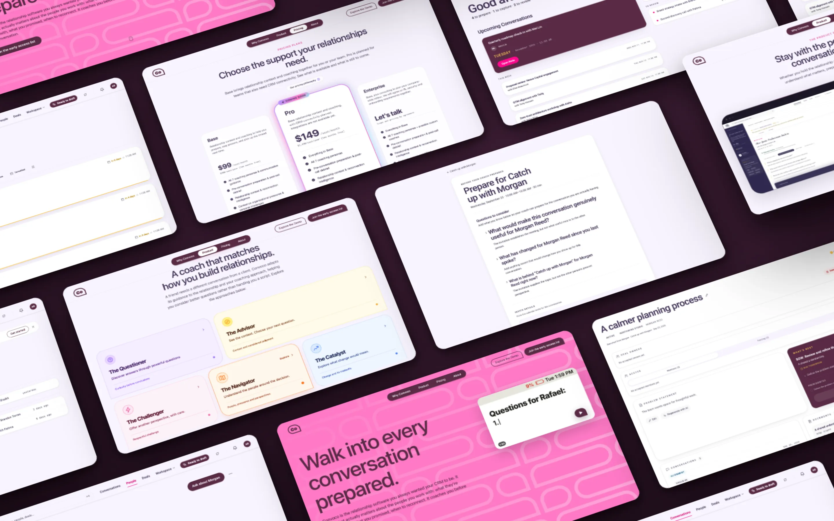
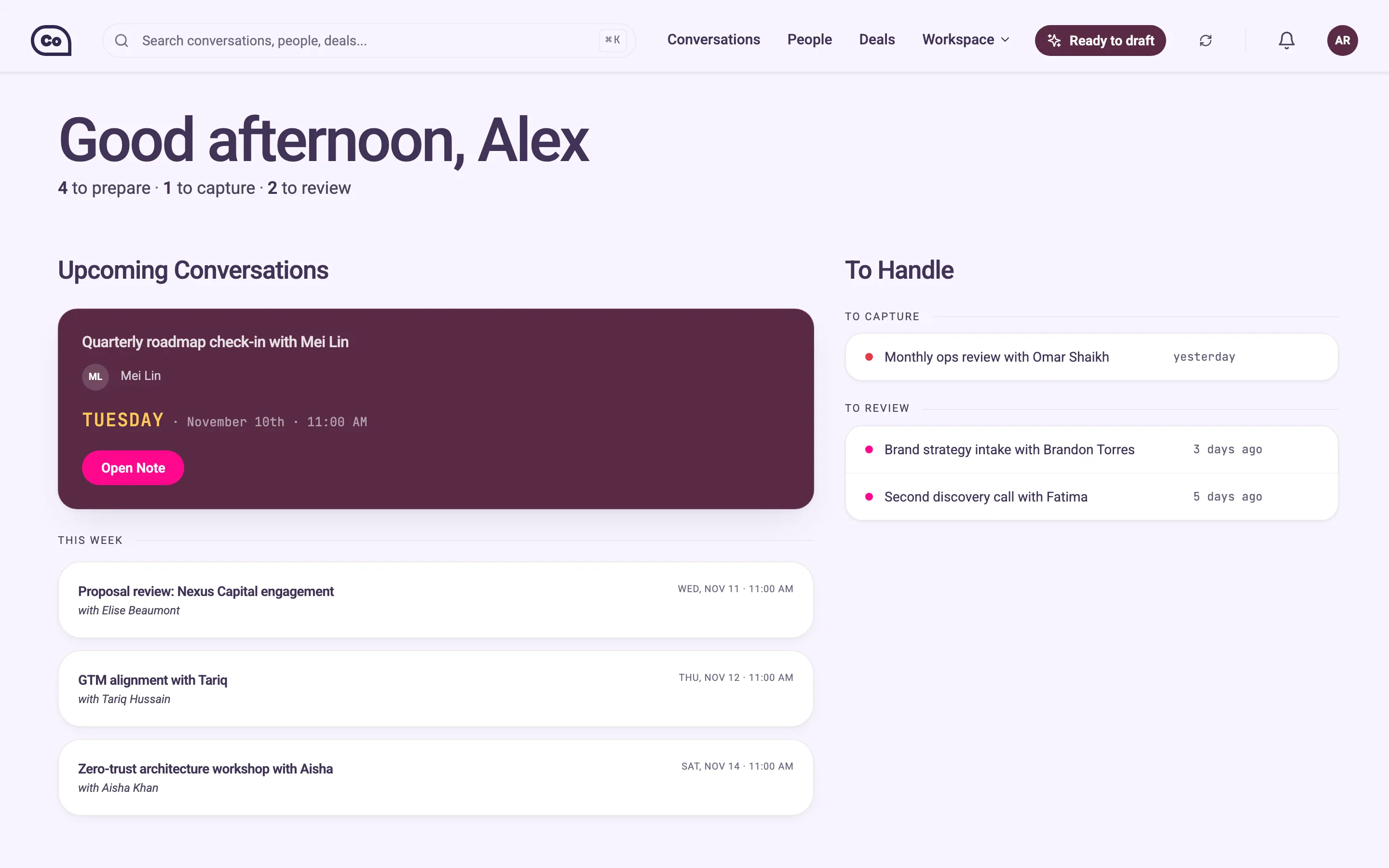
A tilted grid of Convoco screens on plum: the redesigned CRM pages and sections of the pink marketing site.

Convoco

Context
Convoco, via Everyone Needs a Copilot
Role
UX/UI and brand designer
Timeline
Jun 2026–Present

Overview

Convoco is a CRM that coaches you before every conversation, but it was designed from a developer’s perspective using AI tools. I audited the product, reorganized its People page and gave the brand a new visual language.

Results

  • 10Pages audited
  • 40Usability issues found
  • Marketing pages

The new marketing site is live, and the People page is in the product. The rest of the CRM isn’t live yet. We’re waiting on our first beta users to learn what design changes need to be made.

Solution

I redesigned the People page around upcoming conversations, prep and past conversations, with a searchable A–Z list. I condensed a seven-page marketing site into one page, in a lighter visual language built on Copilot’s pink, with a speech-bubble logo for a product that coaches conversations.

Process

The design lead and I started with a heuristic analysis of every page of the CRM, then reworked the People page. Before going further into UX, we wanted feedback from a real user, so we shifted to the brand and the marketing site. The founder marked what was crucial on each of the seven old pages, and, with the help of the design lead, I prototyped and iterated in code with Claude Code and Antigravity.

The Problem

A CRM designed from a developer’s perspective

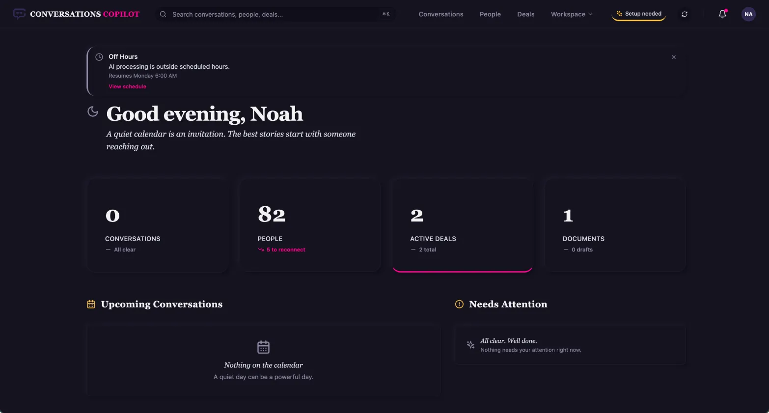
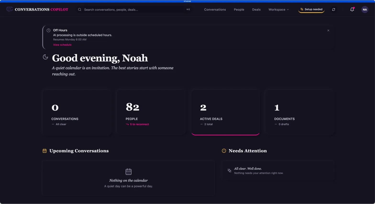
The original Convoco dashboard in its dark theme, before the redesign.
Convoco as first built, designed from a developer’s perspective using AI tools.

Pablo, the founder and developer of Convoco, brought Connor and myself on with an open-ended brief: redesign it. Improve the visuals, the branding and the UX. It was all initially designed from a developer’s perspective using AI tools, and he knew that what he had made didn’t necessarily use best practices, and maybe didn’t make as much sense in the flow.

Connor was the design lead. He acted more as a design mentor, pushing me to go further, and was someone I could bounce ideas off of. I did the exploration, the final designs and most of the implementation.

The Process

  1. Heuristic analysis
  2. People page
  3. Pivot to the brand
  4. Mood board and logo exploration
  5. Content triage
  6. Rapid prototyping in codeLive marketing site

Discovery & Research

Ten pages, forty issues

40 issues across Nielsen’s 10 heuristics

Critical
11
Minor
15
Cosmetic
14
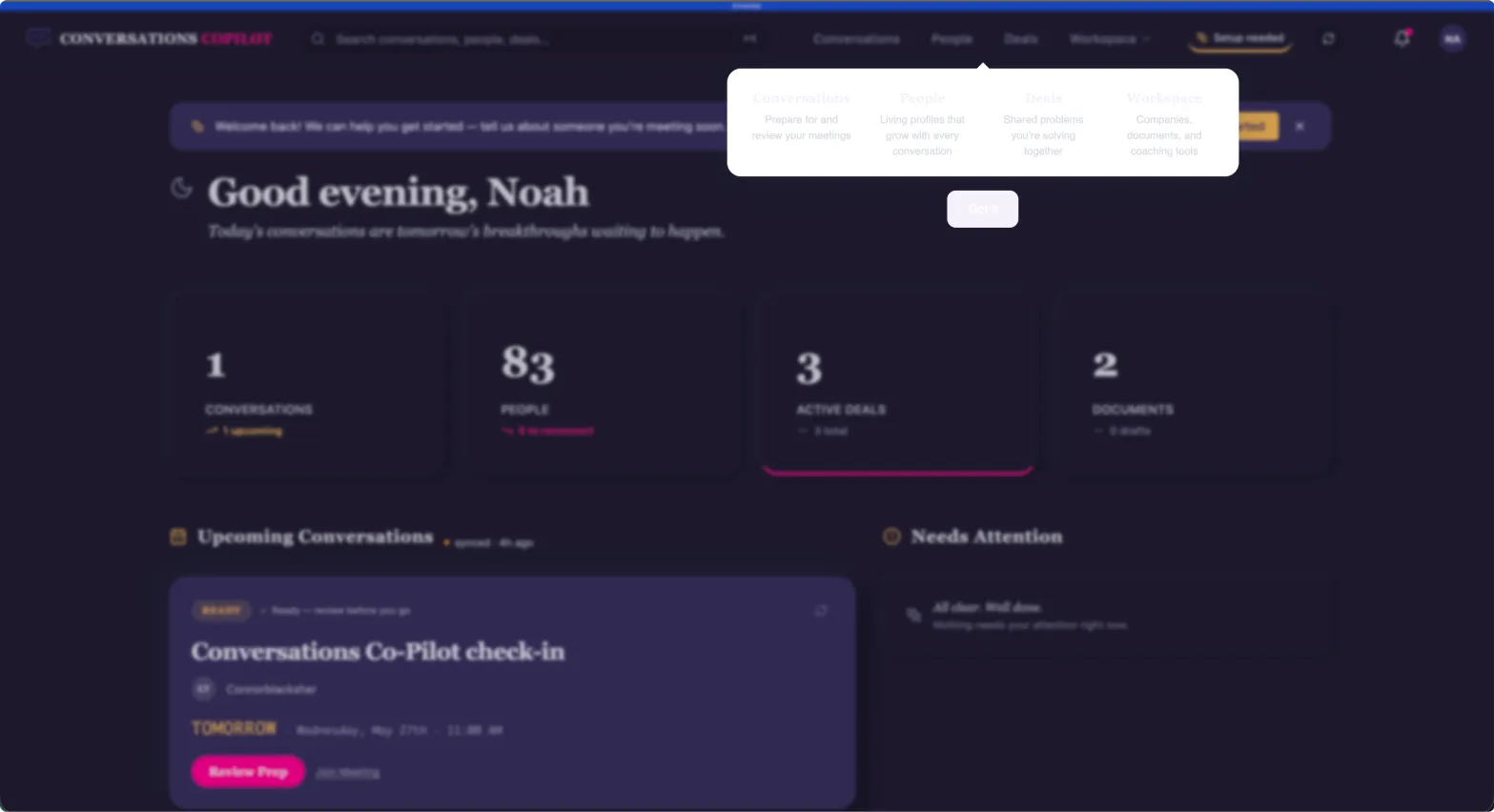
The original dashboard, with markers 1 to 3 on the issues in the audit notes.
The dashboard’s tutorial overlay, with marker 4 on the tutorial card.
  1. DashboardOff Hours banner doesn’t call much attention to itself
  2. DashboardThe pink line makes this card look selected
  3. DashboardColor use makes the hierarchy hard to understand at times
  4. DashboardNearly unable to read the tutorial
Heuristic analysis findings.

This project started with a heuristic analysis using Nielsen’s 10 heuristics. We went through every page of the CRM, ten of them, and noted down the problems we wanted to address: 40 issues, rated by severity, with 11 critical.

I’d never done a heuristic analysis before this, but I was able to hit the ground running because I could lean on my QA background. It felt very natural to go through the different pages and flows, call out what seemed out of line, unintuitive, or like an issue or a bug, and mark up as many as we could find.

  • Finding 01

    A lot of design inconsistencies.

    Differing card sizes, dropdowns not matching the designs and the same colors used for many different things.

  • Finding 02

    Unclear hierarchy and actions.

    A lot was thrown at the user without much indication of priority or importance.

  • Finding 03

    CTAs that didn’t work, and missing capabilities.

  • Finding 04

    Accessibility issues.

    Elements that were hard to read or see.

For the marketing site, we screenshotted every page of the old seven-page site, and I had Pablo go through every single one and leave a comment to indicate what on each page is crucial information.

Insights

Feedback before redesign

Before we really got into doing UX work, we wanted to get user feedback.

We wanted to hear from someone who’d used it hands-on who wasn’t the developer or the designers: what’s working, what isn’t, what’s confusing. That would tell us how to prioritize redesigns. Until then, the product could wait, and the brand could go first.

Ideation & Concept Development

A speech bubble, and a lighter Copilot

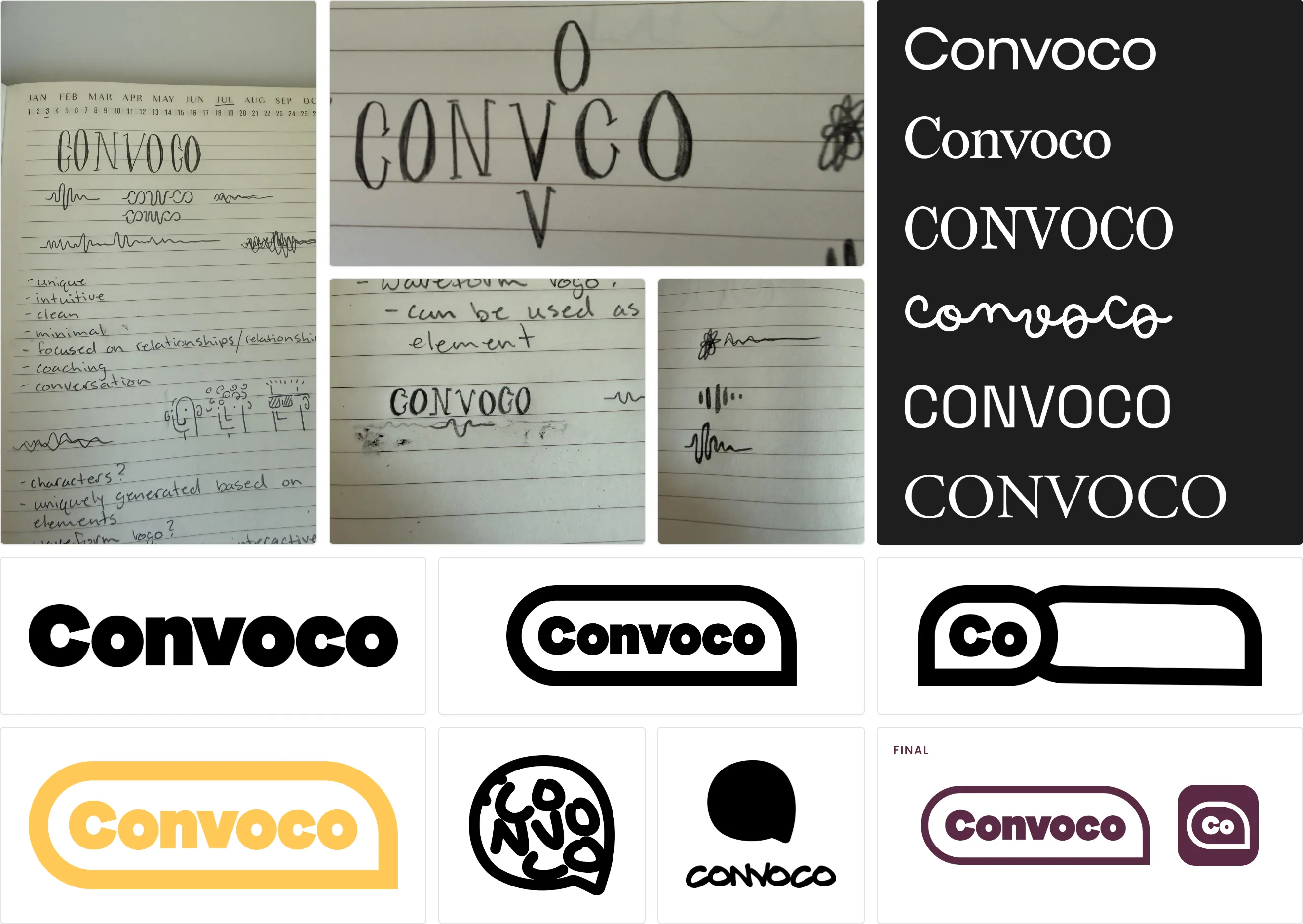
Branding board: notebook sketches, wordmark tests, pill and speech-bubble iterations and the final logo.
From notebook sketches to a speech bubble, because Convoco is supposed to be a conversation.

Connor and I each brought our own explorations, then took the best of each, refined them and bounced new ideas to get further:

Logo routes
Speech bubbles, a CC monogram, a waveform, aviator glasses and a speech-bubble pill.
Color
The Dracula theme, then the light Alucard version, then a pink motif.

Dracula

  • Pink #FF79C6
  • Purple #BD93F9
  • Cyan #8BE9FD
  • Green #50FA7B
  • Orange #FFB86C
  • Red #FF5555
  • Yellow #F1FA8C
  • Comment #6272A4
  • Foreground #F8F8F2

Alucard

  • Pink #A3144D
  • Purple #644AC9
  • Cyan #036A96
  • Green #14710A
  • Orange #A34D14
  • Red #CB3A2A
  • Yellow #846E15
  • Comment #635D46
  • Foreground #1F1F1F

Convoco

Pink #FF79C6

  • Ink #592A45
  • Lavender #EBDEFD
  • Page #F8F4FE
From Dracula’s dark purples to the light Alucard version, then further into pink.

Iteration

From dark purples to light and pink, built in code

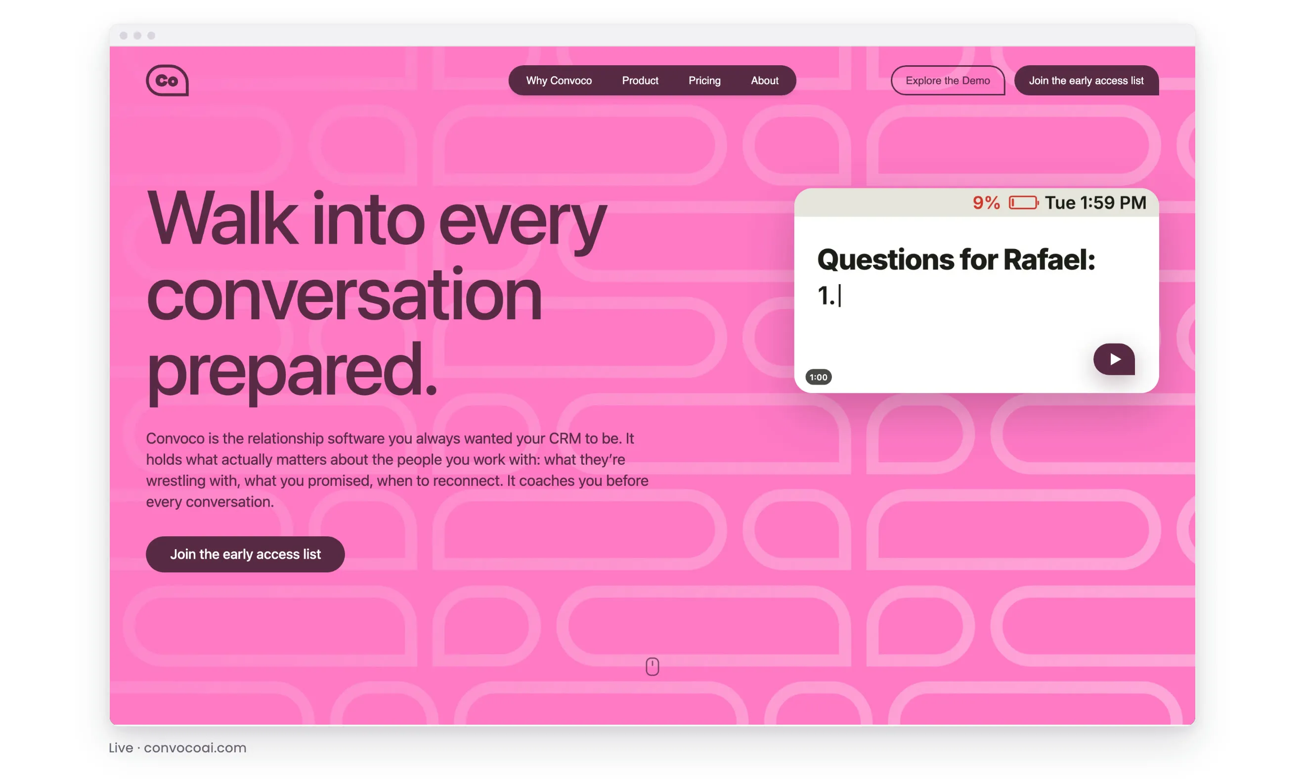
The marketing site’s home page in a browser window, shifting from the old dark version to the new light, pink one.
From dark purples to a much lighter, more vibrant site.

The branding started with the Dracula color theme, leaning into the dark purples. Then we leaned into the light-mode Alucard version a little, and then even further into the pink, to make it stand out and feel alive, engaging and eye-catching.

Using Claude Code and Google’s Antigravity, we quickly prototyped, every time we designed, from the People page to the marketing page. If I had an idea for how a hover state, motion or a loading state should work, I could describe it and see it come to life. I pushed updates from a local environment to GitHub and staging, then Pablo reviewed them and pushed them to production.

Solution

A findable People page and a one-page marketing site

The CRM, before and after: the same screens in the original dark theme, then in the new light theme with Copilot’s pink.

I delivered:

  • A heuristic analysis of all ten pages of the CRM.
  • A redesigned People page, now in the product.
  • A new brand: a speech-bubble logo, a “Co” icon and a lighter visual language built on Copilot’s pink.
  • A one-page marketing site, live at convocoai.com.

01. A People page you can find someone on, not a wall of profiles

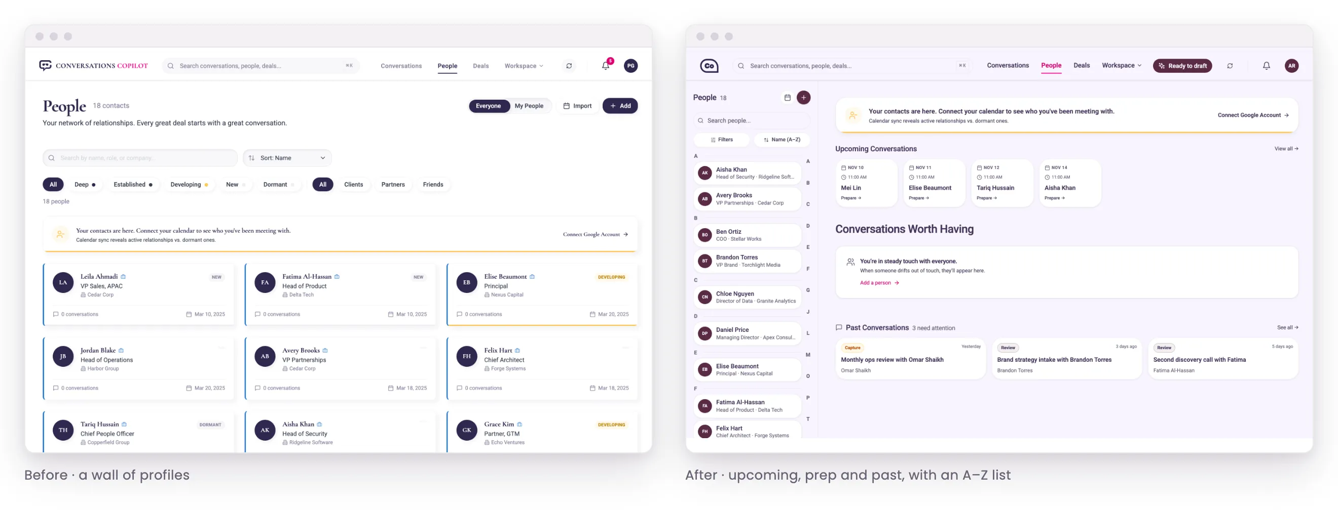
The People page before, a long wall of profile cards, and after, with upcoming conversations and a searchable A–Z list.
Not just a wall of profiles anymore: conversations up top, and a list you can search or jump through by letter.

The People page was a very long list that wasn’t easily organized. We took it to a much more organized layout: upcoming conversations, conversation prep and past conversations, with a searchable, condensed alphabetical list off to the side. You can search it, scroll it, or select a letter to jump to that section. It improved organization and the ability to quickly find people.

02. One page instead of seven

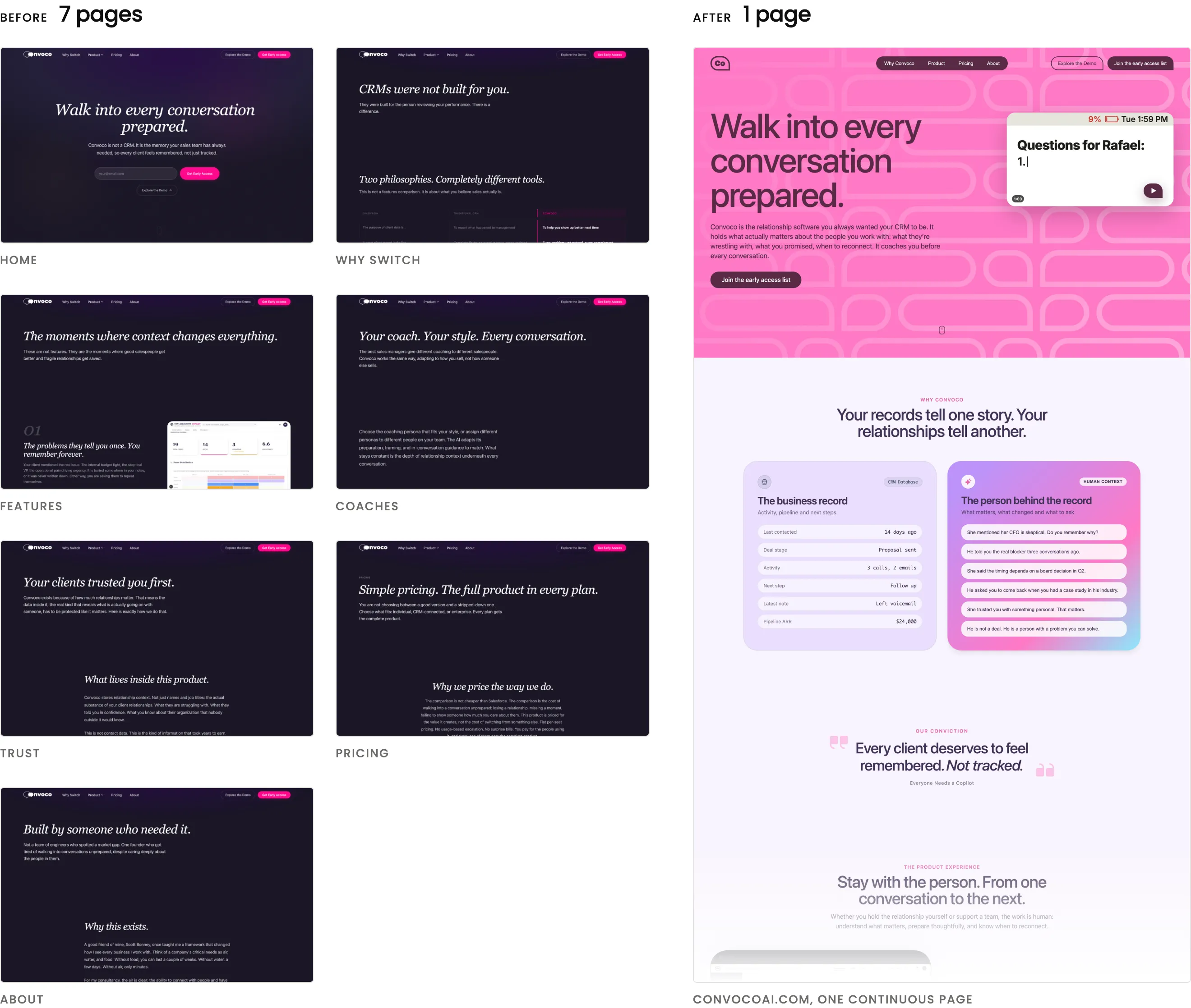
The seven old marketing pages side by side, next to the new one-page site.
Seven pages condensed into one, keeping what was marked as crucial.

There was nothing specifically wrong with the old marketing site. It was a communication and clarification problem. On a marketing page, people are less likely to go and explore, so putting it all together makes it easier on the user. Pablo’s notes on what was crucial on each page decided what stayed, so visitors get all the important information up front to know what Convoco is.

03. Light mode, and Copilot’s pink

The redesigned Convoco CRM dashboard in its light theme with plum and pink accents.
Light mode brings levity, and the pink carries over from Everyone Needs a Copilot.

The light mode brings a certain amount of levity. The pink comes from the existing color pattern: Everyone Needs a Copilot already uses some pink as a brand, so it’s a consistent through line that also works with the light mode.

04. A speech bubble, because it coaches conversations

The Convoco speech-bubble logo and its Co icon.
The Convoco emblem and lettermark icon.

Convoco is meant to improve how you have conversations with clients, coworkers and the people you engage with. It’s supposed to be a conversation. The tool leverages AI to make you better at having conversations, not to replace you: it coaches you and prepares you for the conversations you’ll have. So the logo is a speech bubble.

Impact & Results

Live, and waiting on its first users

The new marketing site is live, and it was positively received by Pablo. The People page is in the product. The CRM itself isn’t live yet, but it carries the new visual language from the branding changes Connor and I made.

What’s unproven is whether any of it helps a real user. We’re working on getting initial beta users. We only need one before we can start interviews, see how they engage with the product and understand where the pain points are.

The project isn’t done. We’re in a new phase, setting up for the next round of work: interviews with beta users, then UX and UI updates to the CRM. Once we have users, the CRM will evolve as we learn where the pain points are, ideate, and test solutions.

Reflection

Push the brand further

  • What went well

    The new site is fun, and it was successful at condensing the information down into one page. The People page is much more navigable, because it isn’t just a wall of profiles anymore.

  • What didn’t go as well

    It’s slow going. We’re still waiting on users to give us feedback, so we can make the improvements that actually improve the product.

  • What I’d improve

    I would have liked to push the branding further than I did. Branding isn’t my strong suit, and I wish I’d pushed myself harder to make it more unique: how can a product that leverages AI stand out among other AI-based products? That’s something I plan to come back to while working on this project.

Working with other designers can take creative work a lot further. With Connor, ideas tended to be pushed further, and we could build off of what the other did.